Sunday, August 22, 2010

Mona . . .


 . . . is, I think, done.  Certainly I've completed the ritual 'finishing' things - flicks of v diluted colour for the hair, brows and lash details and signing of course - but I'll have another look next weekend to see if the highlights and shadow tones are as good as I can get them.

Sunday, August 15, 2010

Sketch Work Mostly

Out at Pyndan Camel tracks today drawing and photographing in the bracing wind and sunshine, so not much time on the canvases. But I did enjoy the time I had, even if it was equally bracing inside as working with turps involved both doors open and the fan going . . . .
Still working on some proportions, but they're the simpler ones of chin length and jaw/cheekbone width, I think, rather than the painful ones of nose/eye/mouth placement which means a lot more scrubbing out to change.

Sunday, August 8, 2010

It's Nice When It Happens . . . x2

1 . . paintings that move fairly smoothly from sketch to blocking in colour.  It happens probably about once every 10 pieces:  the usual way is to 'lose' the picture somewhere at this stage and the process is then one of trying to 'find' it again.  The last time I can remember was Ron's portrait, about this time last year.  Of course it makes it an absolute joy to do (with the nagging sick feeling that it could still go wrong, but a price I'm happy to pay).

2.  . . getting to the stage of glazing and going well, starting to really see the person coming out of the picture:  I tend to slow down at this stage (from a fairly slow pace anyway, so this is now nano-movement), a bit like when I'm close to finishing a book and I don't want it to end (again, something I'm doing at the moment too, with Vera Brittan's Testament of Youth, a sort of feminist version of Goodbye to All That)

Still not sure where I'm gong with this one, but it's an interesting journey so far . . .

Saturday, August 7, 2010

Little Layers for Mona

Now the composition's just about there (sorted her nose today and while I still need to do something with the right eye it won't mean a major re-shuffle of everything) I'm enjoying starting to work with the glazes to play with tone and shape.  Funnily enough I've been mainly using Indian Red and Ultramarine (and white of course), which, when I let myself cheat a bit with burnt umber really does give a lot more colour possibility than I'd have imagined. Well I never!

Monday, August 2, 2010

The Sweet Smell of Signed and Sealed Satisfaction (Sort Of)


Or retouch varnish . . .
Nothing like leaving it to the last minute, but today's public holiday, Picnic Day (dontya just love the NT) was Varnish Day, or alternatively, 'Will you just put the brush down and accept it's done' Day.  So varnished Boy in Cap and Betty and now just have to hope they're dryish by tomorrow morning, when I need to take them to Araluen.


Between the multitude of 'this is the last bit' moments on these two I actually got quite involved in a bunch of others.  Did a bit more to the other Betty, and on the roll that was the three day weekend also did a major revamp of Mona's portrait to fix the profile line that I was never happier with.

 This then entailed repainting the whole thing as lots of things ended up skewed as a result.  Much happier with her now, and looking foward to doing more on her now I'm less distracted by Cap Boy and Betty.

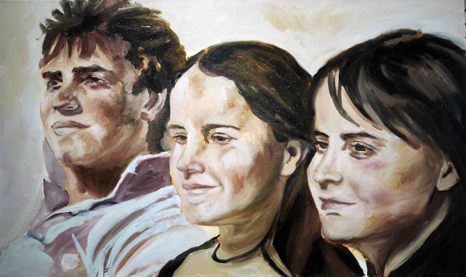
Also did a bit more on the Schmidt commission, which I can now give a bit more attention to. I was reading somewhere about a challenge of painting a portrait in only two colours plus white which intrigued me.  The colours were a kind of red ochre and ultramarine blue.  I'd seen, years ago, an amazing portrait painted with only mars violet and payes grey  (and white) and couldn't get my head around how the guy did it.  This most recent article showed the palette and the work in progress (yes you can get a kind of warm yellowy tone out of the mix) and has got me challenged.  I've always just 'done' colour, without really thinking about mixing and all the theories (beyond a bit about warm and cool, and complementary/contrasts on the colour wheel), but I really want to give it a go.  So I had a  bit of one with this first colour layer on the portraits.  As you can see, I've managed lots of browns and purples, but nothing warm (the yellow is the underpainting of raw sienna).  Maybe I'll try on something smaller . . .

 And between all that I got the trusty boards out and played around with some little sketchy things.  Tried doing the first sketch with charcoal, then a spray of workable fixative, then with the turps and burnt umber mix.  I enjoyed it, but am not sure exactly how well it worked.  I think the top one's got potential, but the bottom one doesnt quite work.  All fun though.