Wednesday, July 30, 2008

Try Squinting . . .

Honestly . . . they look better that way . . . or dim the lights . . . no, really . . .

Poor Dugald: just as I'd calmed down his somewhat riotous skin colour in the last past, I had to go and start playing with vermilion again . . . strange as it may look, I'm quite pleased with the progress here: his nose is still a bit crooked, but less so; I've cut off some of the excess heaviness to the lower part of his face; the strong sunlight from the right is working better on his mustache; the eyebrows have got a better shape, as has his neck. Still not happy with the eyes yet, but I'm hoping to finish this coming long weekend (if the lingering cold will be gracious).
The great lines of the model's neck, arm, stomach and leg (a kind of elongated C shape) are, conversely what made this a devil of a job to get looking natural. The placement of the head and the length of the dangling leg were the not quite there bits on this underpaint. (I've never done gridding toscale up accurately from sketches or photos, preferring to do it by eye. Perhaps here it might have made sense.) Decided to move one, and address the problems with some colour, rather than obsessing too much at this too early a stage.
'She's a bit sunburnt isn't she?' Thanks, Bean. Definitely better with the legs here, though now I'm worried about the tilt of the head. Enjoying putting the colour on though.

Campbell in Progress

I'd been intending to produce an oil of Campbell (swagman and bush balladeer) for over 6 months, since completing a pastel of just his face. His shirt, belted jeans and hands give more of a sense of his lifestyle and his character, that I missed including in the earlier pastel (only hinting at in the battered old Akubra).I'd left the painting at this first, underpainting, stage for ages while I worked out how I wanted to lay the various colours in and what kind of a background would work.
This was a bit of an experiment, playing with building up the colour, shape and tone through masses of little brush strokes. It doesn't look too bad in this image, but the reality was it didn't work at all: the shirt ended up far too fussy and distracting, the hair resembled nothing as much as a cheap wig and the arms (which I hadn't painted in that way at this point) were a disaster, looking like he'd been attacked with a cheese grater. The background was also a bit insipid, not supporting the sense of high key light that is such a part of his environment as well as helping to contour the strength of character in his face.

Campbell II: Oil on Linen (81cm x 68cm)

I'd left it again for over a month and came back to it last weekend, determined to complete it or take it off the stretchers and condemn it to the Redback sanctuary in the shed. Out went the lines and the pale background, in came a much looser treatment of the shirt and hat, and a smoother glazing approach to his face. Happy now. I think.

Monday, July 14, 2008

'Dugald' and 'In the Studio' in Technicolour of Sorts

In the last blast of the holiday painting splurge . . . got a couple of hours in on Sunday before the commitments of work begin again. 'Dugald' looks good in really dim light or squinting (the painting, I'm talking about) . . . um . . . but all rather garish otherwise. So, how to get the 'really dim light and/or squinting' effect in normal conditions without overworking it . . .'In the Studio' girl needs major surgery to her legs (I got a bit carried away on the underpainting with the long lines of the composition and rather over extended her lower legs and feet). On the plus side, I'm going to have fun painting the towelling robe and its contrast with the wood of the foreground easel. I'm also considering keeping the contrast between brightly coloured girl and stool and almost mono everything else, if it doesn't end up looking like a dodgy out take from Pleasantville/Sin City.

Saturday, July 12, 2008

A Couple of Skies

These were the two I'd been having a bit of trouble with: tones in the sky I thought was the main problem, combined with cliched-looking tree silhouettes. Came back to them fresh yesterday with some confidence from completing the In the Clouds series and, by sheer fluke and a bit of laziness, achieved a solution of sorts . . .

Redbank Winter Sunset (Owen Springs): Oil on Hemp (41cm x 92)

Redbank Dawn (Owen Springs): Oil on Hemp (66cm x 71cm)

The solution was to stop worrying about the sky and concentrate on the tones of the trees. I wanted to get started on the painting but the brush I was going to use for the clean whites and pastels of the skies had brown on it, so I began using it on the darks of the trees, simply to warm myself up on the painting again and to wipe off the colour before cleaning it properly. The slightly muddy burnt sienna colour seemed to work quite well to suggest the backlit effect on the edges of the silhouette, so I kept going.

Long live the rule of sloth.

Friday, July 11, 2008

The Last Wreck (for a bit)


Take the Long Way Home II: Oil on Linen (92cm x 92cm)

And thus completes the first series of Wrecks. Just as well, really, as we were on the clay pan the other day making pictures of new ones (and more rusted/demolished versions of the ones already there).

Yes I know, a version of the above is masquerading as completed with all the other Wrecks, but I went back to it and tightened up some of the fuzziness of the engine that I didn't like.

Thursday, July 10, 2008

One, Two, Three, Many

Thanks, Ploughman for the answer to my conundrum: polytych indeed, for any picture composed of more than three separate panels. Poor four, having no name all of its own. Dip, Trip and Poly, though, sound like somewhat dysfunctional family, so perhaps it's as well there are not more of them.

Might have to do another polytych though . . . clearly people have not painted enough of them for a four-piece to have its very own name . . . not for that reason (a bit late I think), but to have the still slightly silly sounding name for what I'm painting in my head when I'm doing it . . .

Nudes

The first two are smaller monotone oil and turps studies, using an lot of wiping back to create line and highlights.

Study of Side of Sitting Girl: Oil on Hemp (35cm x 35cm)

Study of Back of Sitting Girl: Oil on Linen (25cm x 20cm)

This is a more worked painting: various thin layers of oil glaze on a textured background. I had intended to keep it rougher, with bolder colours and bigger brushes but got caught up in the delicacy of the model's hands and face and the rest of the picture took its cue from there. It's my first colour work and now I'm keen to do more. Very satisfying.

Sitting Girl with Bracelet: Oil on Hemp (74cm x 52cm)

This last is a bit of an experiment with composition: looking at the model from behind an easel that has her robe draped over it. I'm interested in capturing the drapes of the robe against the roughness of the wood of the easel (also a bit blackened, a victim of the Art Shed fire). I also love the incongruously modern mess of the electrical gear in the background (an air compressor and blue electrical lead!)

We shall see if it works. . . (if the foreground thing is too distracting or mannered, I'll probably re-stretch the canvas on smaller bars, re-framing the composition more conventionally around the girl).

One of the few tutored courses I have attended was a life drawing class, conducted on the first floor of a beautiful but bitterly drafty (it was winter) Georgian terrace near Sydney Gardens in Bath. That was in 1989, just before Bean and I make our first trip down under on a working holiday. The other participants were all awe-inspiring in the quality of their work and the tutor was kindly but stubborn about finding ways to get me drawing in a looser and broader manner (from the 'stand to the side of the paper and draw not looking at it, just at the model' to 'draw the contours in one continuous line, not lifting from the paper' to using jumbo purple and green chalk on black sugar paper, and, my personal favourite, though most disturbing at the time, stick and ink (I did manage to get some of the ink onto the paper, though still twinge when I think of what must have stained the lovely Georgian floorboards).

It was about a 6 or 8 week course, 3 hours every Thursday night: after work at Chapter and Verse Booksellers by the Abbey I'd trudge down a dark and blustery Pultney Street, clutching my A2 portfolio against the wind (it all sounds quite Dickensian now). We had a range of models, young and old, male and female and it was one of the experiences I've probably gained most from, both technically (thank you, ink and stick) and in terms of shaping my interests in art practice.

So I've a soft spot for life-drawing, both as exercises in observation and line, and in creating finished works. People's bodies are endlessly interesting: shoulders and toes and waists are great to draw. I also love seeing how people hold themselves, and the way cast light shapes form and conveys emotion.

I returned to life drawing a couple of years ago, through the CAAS (Central Australian Art Society), which would book 4-6 weeks worth of 2 hour Sunday sessions with a model at the old Art Shed. Not a very auspicious start, as shortly after the first series I attended the shed was a victim of arson. Since then, we've been meeting in a CAAS member's studio whenever we can book a model. Up until recently we'd not found anyone suitable for almost a year, and then a Dutch backpacker responded to our ad. The results are below, based on the 10 minute pose sketches and some photos.

Thanks, Nanda, for responding to the ad: you were a lovely model.

Wednesday, July 9, 2008

Works in Progress

I always have mixed feelings at the start of any new painting: primarily huge excitement and a sense of anticipation as I'm never exactly sure where I'm going to go with it is the main one (I do do the odd bit of thumbnail preparatory sketching at times to play with composition, but not for every painting, so often I start straight with slopping the paint onto the canvas and change things around as I go). Apprehension is always there too though (just what have I let myself in for this time,? is the luck that that had led to some pictures I'm happy with going to run out? who am I kidding? etc etc), the flip side, I imagine, of the thrill of the blank canvas and the pictures in my head.

I haven't settled on any one particular subject matter, material or way of putting the paint onto the canvas, so the safety net (and demands) of an established style tend to heighten the sense of risk and excitement.

Second stage is after the under-painting or ‘first draft’ (a phrase that’s hung around from when I used to write). This is where sometimes it’s really hard to continue: I like what it looks like at this stage and know from experience that I will make it look a lot worse before it comes good again (if it does).

There are some pictures that were at their best in this first stage.

This one, even with its scrubbing out on the left was quite nice at this stage. After I put the sky, clouds and colours in, it gradually slipped into 'disappointing' and will soon be taken off its stretcher bars and rolled up, consigned to a large family of recalcitrants in a corner of the shed.


I do like the loose early stages, tending to work with whatever colours are on the palette and lots of citrus turps, pushing contours around with a big brush and wiping out highlights with old rags. The next two are the ones I started yesterday. The NT Portrait of a Senior Territorian Art Award closing date has been extended till September so I've gotten going on a couple of Dugald (President of the Central Australian Art Society and all round good bloke).

I'm going through a bit of a portrait phase and started the other one below a week or so ago, in the first flush of the school holidays.

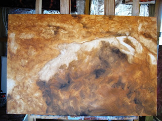
The last few are landscapy things (probably the area I feel least comfortable with, but more on that some other time) which I'm almost loath to do more with . . . but I rather think more needs to be done to make them recognisable to anyone other than me . . .


In the Clouds

I'm always a bit chary of sky paintings as it's so easy to do them sentimental and cliched, with over bright colours that look like those 1970s Athena foil posters. Having said that I do like trying to paint cloud formations (we don't get much cloud in the Alice and in the UK it's usually just an amorphorous grey blanket without shape or tone). And of course some of the most interesting times are when there's a bit of colour in them at sunrise or sunset.

The following three little ones have been sitting in the studio incomplete for ages. I've just started a couple of quite large new works (more on that later) and while waiting for the underpaintings to dry and give myself space from them I thought I'd go back and finish these three. They're from photos taken in a plane from Alice to Darwin (hence the beginnings of some interesting looking thundery stuff in the background). I like the odd perspective (Bean insists one of them is upside down) and the combination of jet stream like lines and fluffy stuff.

In the Clouds I: Oil on Linen (20cm x 35cm)

In the Clouds II: Oil on Linen (28Cm x 35cm)

In the Clouds III: Oil on Linen (35cm x 41cm)

Friday, July 4, 2008

People in Paint

Walking in the Storm: Oil on Canvas (59cm x 120cm)

Waiting at the Gate: Oil on Linen (36cm x 65cm)
Chroma Encouragement Award for First Time Entrant 2006: Advocate Art Awards

Self Portrait: Oil on Linen (61cm x 61cm)
Faces Section Winner: 2008 Advocate Art Awards

Boy with Bowl: Oil on Hemp (40cm x 102cm)

Lunchtime in Chinatown: Oil on Linen (20cm x 61cm)

In the Cattleyards: Oil on board (46cm x 67cm)

Emmy: Oil on Canvas (79cm x 27cm)


Emmy and Crown Pilot: Oil on Board (32cm x 77cm)

Car Wrecks

There's a claypan close to where we live, and on the claypan are the wrecks of cars. They're all quite different and offer surprisingly gorgeous colors and shapes. It's an intriguing relationship between these slowly decaying elements of the modern world and one of the oldest landscapes on the planet.

Dazed, Beautiful and Bruised: Oil on Linen (153cm x 76cm)

Dazed, Beautiful and Bruised II: Oil on Linen (92cm x 92cm)

Everything Must Go: Oil on Canvas (112cm x 46cm)

Everything Must Go II: Oil on Linen (112cm x 33cm)

Take the Long Way Home: Oil on Linen (76cm x 50cm)

Take the Long Way Home II: Oil on Linen (92cm x 92cm)

Urge for Going: Oil on Linen (33cm x 80cm)

More Camels

Lucy: Oil on Linen (71cm x 102cm)

Bill's Eye: Oil and Oil Pastel on Linen (47cm x 35cm)

Sunset and the Camels: Oil on Linen (76cm x 36cm)

Desert Light: Oil on Canvas (60cm x 90cm)

Before the Rain: Oil on Hessian (56cm x 66cm)

Camel Portraits

I painted camel portraits for many years before I tried my first person (in 2004). Camels really are as individual as people, with a similarly wide range of temperaments and moods . . .

Joan: Oil on Linen (28cm x 36cm)

Lily: Oil on Canvas (46cm x 36cm)

Cuzco: Oil on Linen (31cm x 28cm)

Chester: Oil and Oil Pastel on Linen (47cm x 47cm)

Bill: Oil on Linen (36cm x 36cm)